How To Make Mobile Friendly Website? Ultimate Guide 2025
")
Did you know 55% of all web traffic now comes from mobile devices? With Google’s mobile-first indexing and users abandoning sites that take longer than 3 seconds to load, optimizing your mobile site isn’t just an option, it’s a necessity.
A seamless mobile experience can:
- Increase conversions by up to 67%
- Reduce bounce rates and keep users engaged
- Improve search rankings and brand credibility
How To Make Mobile Friendly Website?
The mobile friendly web design strategy can transform your performance. Companies with fast, user-friendly mobile sites see up to 67% higher purchase rates, along with lower bounce rates and stronger brand loyalty. This guide will provide you the complete information about Mobile-Friendly Website Design and SEO Optimization. So let us discuss these in a guide.
What Is Mobile Friendliness Website?
Mobile friendliness is the measure of how well a website is designed and optimized for mobile devices such as smartphones and tablets. A mobile-friendly site automatically adjusts to fit any screen size while ensuring users can navigate and consume content with ease. It also avoids intrusive pop-ups and interstitial ads that obstruct content visibility on mobile screens.

There are two primary ways to achieve mobile friendliness:
- Responsive Web Design – Uses HTML and CSS to adapt the website layout based on screen size automatically.
- Mobile-Optimized Website (Mobile Subdomain) – A separate version of a website hosted on a mobile subdomain (e.g., m.domain.com), specifically designed for mobile users.
Why Mobile-Friendliness Matters for Website SEO?
Mobile-friendliness is a critical ranking factor in Google and Bing’s search algorithms. Google prioritizes mobile-first indexing, meaning it primarily crawls and ranks the mobile version of a website. A non-mobile-friendly site is likely to experience lower rankings and reduced organic traffic.
With mobile web visits overwhelmingly outpacing desktop visits, a mobile-optimized site is crucial for reaching and engaging users in 2025.
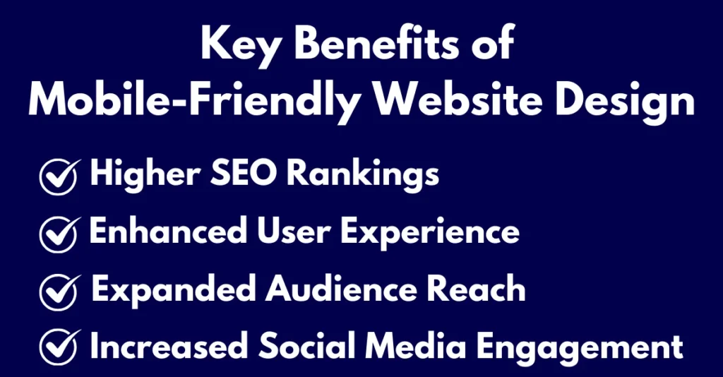
Key Benefits of Mobile-Friendly Website Design
Here are the key benefits of the mobile friendly website design:
1. Enhanced User Experience
A seamless mobile experience leads to lower bounce rates, higher engagement, and increased conversions. Mobile users expect quick access to information, easy navigation, and fast load times.
What Users Demand from Mobile Experiences:
- Instant access to key information without excessive scrolling or zooming
- Thumb-friendly navigation that accommodates one-handed use
- Lightning-fast interactions with no lag or delayed responses
- Intuitive layouts that require zero learning curve
 When you meet these expectations, the results speak for themselves:
→ 50%+ reduction in bounce rates
→ 20-30% increase in time-on-site
→ Up to 2x higher conversion rates compared to poorly optimized sites
The most successful mobile designs in 2025 will go beyond basic responsiveness they’ll anticipate user needs through predictive placement, contextual menus, and performance-optimized interfaces. Every micro-interaction matters, from smooth scrolling to instant form feedback.
By focusing on these UX fundamentals, you’re not just improving usability you’re building a competitive advantage that directly impacts your bottom line.
READ HERE: How to Make an Interactive Website?
2. Higher SEO Rankings
Since Google uses mobile-first indexing, a non-mobile-friendly site can rank lower in search results, leading to reduced visibility and fewer visitors.
Why Mobile-Friendliness Impacts Rankings:
- Primary Crawling: Googlebot now primarily crawls and indexes the mobile version of your site
- Core Web Vitals: Mobile page experience signals (loading speed, interactivity, visual stability) directly affect rankings
- Traffic Penalty: Non-optimized sites may disappear from mobile search results entirely
KEY FACTORS TO BE FOCUSED
✔ AMP-like loading speeds (under 2.5 seconds ideal)
✔ Responsive design that passes Google’s Mobile-Friendly Test
✔ Structured data markup that renders perfectly on mobile
✔ Content parity between mobile and desktop versions
Sites with superior mobile experiences see up to 68% more organic traffic than their non-optimized competitors. The message is clear, In Google’s eyes, your mobile site isn’t just an alternative it’s your primary digital storefront.
Pro Tip: Use Google Search Console’s Mobile Usability Report to identify and fix critical mobile ranking factors before they impact your visibility.
3. Expanded Audience Reach
With 62% of internet users accessing websites via mobile, businesses that prioritize mobile-friendly website design. Moreover mobile-friendly website design can reach a broader audience and improve engagement across devices.
The Mobile Advantage:
- Expanded Reach: Access the majority of internet users who primarily browse on smartphones
- Enhanced Engagement: Mobile-optimized sites see 40% longer session durations than non-optimized competitors
- Cross-Device Consistency: Seamless experiences that maintain quality across smartphones, tablets, and emerging devices
The most successful brands in 2025 will treat mobile not as an afterthought, but as their primary digital interface. By implementing these mobile-first strategies now, you position your business to capture more traffic, deepen engagement, and outperform competitors still clinging to desktop-centric approaches.
Mobile is becoming not just the first screen, but often the only screen.
4. Increased Social Media Engagement
Social media platforms are primarily used on mobile devices. A mobile-friendly website makes it easier for users to share and interact with content. It also helps in boosting social engagement and brand awareness.
Viral Readiness
- Frictionless sharing with mobile-optimized social buttons
- Instant-loading content that doesn’t break when shared
- Visual-first layouts that mirror social platform experiences
Engagement Amplifiers
- Tap-to-engage calls-to-action that convert scrollers into participants
- Stories-style navigation for younger demographics
- Seamless social logins reducing conversion barriers
Brands with mobile-optimized sites experience:
→ 3× higher share rates compared to desktop-only content
→ 40% more social referrals from mobile users
→ 28% boost in branded hashtag usage when mobile experiences align with social
Pro Tip: Implement social-proof elements like live feeds and mobile-friendly testimonial carousels to create a cohesive journey from social platforms to your site.
Your mobile site isn’t just where social traffic lands it’s where social engagement converts into measurable business results.
Mobile-Friendly Website Design Practices
Here are the best practices for the mobile-friendly website design:
1. Use Responsive Design
A responsive website automatically adjusts its layout and content to fit any screen size. This method is recommended by Google and ensures consistency across all devices.
To implement responsive design, add the following viewport meta tag to your website’s
<head> section:
<meta name=”viewport” content=”width=device-width, initial-scale=1.0″/>
2. Simplify Navigation
- Use a hamburger menu (three horizontal lines) to keep navigation clean.
- Limit the number of menu items to key pages.
- Ensure links and buttons are large enough for easy tapping.
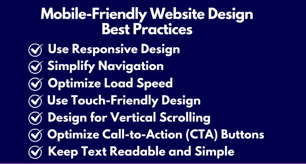
3. Optimize Load Speed
Google recommends above-the-fold content loads in under one second. Faster load times improve user experience and conversion rates.
Tips to Improve Mobile Load Speed:
- Optimize images by compressing them and using WebP format.
- Implement lazy loading for below-the-fold content.
- Reduce third-party scripts that slow down the site.
- Use a Content Delivery Network (CDN) to speed up content delivery.
- Enable browser caching to improve returning visitor load times.
4. Use Touch-Friendly Design
- Ensure buttons are at least 48px × 48px for easy tapping.
- Use large input fields and drop-down menus.
- Avoid hover effects, as they don’t work on mobile devices.
5. Design for Vertical Scrolling
In the mobile era, vertical scrolling isn’t just a behavior—it’s the dominant content consumption pattern, with 90% of users scrolling vertically through sites. Smart designers leverage this natural motion to create intuitive, thumb-friendly journeys that drive action.
Vertical design done right increases:
→ Conversion rates by 34% through strategic CTA placement
→ Dwell time by 28% with proper content pacing
→ Navigation efficiency by 3x with thumb-friendly menus
6. Optimize Call-to-Action (CTA) Buttons
- Position CTAs at the bottom or center of the screen.
- Use contrasting colors to make CTAs stand out.
- Keep CTA text short and action-oriented, e.g., “Buy Now” or “Sign Up.”
7. Keep Text Readable and Simple
- Use a minimum 16px font size for body text.
- Stick to mobile-friendly fonts like Helvetica, Arial, and Open Sans.
- Break up content into short paragraphs and bullet points.
Testing Mobile Friendliness
Ensure your website is mobile-friendly using Google’s Mobile-Friendly Test Tool: Google Mobile Test
Leveraging Google AMP for Faster Mobile Performance:

Google’s Accelerated Mobile Pages (AMP) is an open-source project designed to improve mobile site speed.
AMP Benefits:
- Loads almost instantly on mobile devices.
- Prioritizes above-the-fold content, ensuring users see important information first.
- Reduces mobile bounce rates and improves user engagement.
To implement AMP on WordPress, install the AMP Plugin and follow the setup instructions.
In today’s mobile-driven world, having a mobile-friendly website is essential for SEO, user experience, and business success. By implementing responsive design, optimizing load speeds, and ensuring touch-friendly navigation, businesses can improve engagement, increase conversions, and maintain high search engine rankings. Make mobile-friendliness a priority and stay ahead in the digital landscape!
Read More: